Here is my final design for the magazine advert. Personally I think that it has become a very effective piece of advertisement, that, if used in the real world industry, would help to majorly populate fans for this artist and spread the word of his new arrival to the scene.

(Click image to view full resolution)
From the previous versions, I decided to make a few minor changes, which would improve the appearance of the advert. I decided to include snapshots of the music video, to fill the blank space at the bottom of the page, but also to show what would be included in the DVD, and some more images of the new artist which is being advertised here, showing the three different scenes that were dominant in the video. I made two text ammendments; the "It doesn't much get better!" testimonial was a typo so I fixed that, and changed the colours of the line "Features bonus tracks..", to be all one colour, to avoid any confusion when looking at it. The preview image of the DVD, placed on the centre-right of the page was resized to a portrait-view to allow a more accurate preview rather than it being in the shape of a CD cover.
The idea of the main image was pretty simple, but it's outcome was better than I had intended. I decided to use an image from some of the original footage gained from the filming stage that I still had backed up, and then played around with some levels and curves effects to liven up the image and show a better contrast with the lighting, then adding a filter to give it a cartoon-like visual. The 'JSK' logo was a scan from an image the artist drew for me. Due to it being his signature he created for himself, I decided to use it as a logo for the artist.

(Click image to view full resolution)
The idea of the main image was pretty simple, but it's outcome was better than I had intended. I decided to use an image from some of the original footage gained from the filming stage that I still had backed up, and then played around with some levels and curves effects to liven up the image and show a better contrast with the lighting, then adding a filter to give it a cartoon-like visual. The 'JSK' logo was a scan from an image the artist drew for me. Due to it being his signature he created for himself, I decided to use it as a logo for the artist.

(Click image to view full resolution)
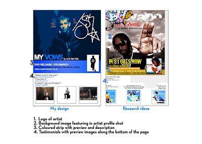
As you can see from the image above, I have displayed a design from the magazine adverts I have looked at to represent the design I created, and how I thought of the ideas to use them. Several different adverts were placed together so that I had the ideas, and the final product looks somewhat similar, but alot better than the image I created to work as the template.
From following ideas researched from magazines, I have followed typical styles included within my genre for adverts in magazines. The image of the artist is the focal point within the magazines, with his/her logo or name being the second largest image, to show the importance of the artist. Testimonials will be used sometimes, to then convince the reader to buy the product because it will say how good it is, giving other people's opinions, being biassed towards it, but making you feel confident in wanting to buy it from what they say. If the artist has other music albums available, or if the record label they are signed to has other artists, then images of their CD's will be shown. As my advertisement is for a DVD, I decided to show previews of the music video, to work in the same way, by making the reader have a general idea of the genre and content from the images presented.

No comments:
Post a Comment