Critical evaluation Question 2
How effective is the combination of your main product and ancillary texts?
The DVD Digipak was initially intended to show some idea linking to the music video. I did consider taking the photographic approach, including a photo or two which would act as the front cover. This idea changed, due to wanting a more sophisticated cover, that didn’t look so bland, and that would relate to the artist and his personality. The genres for hip-hop/grime typically use an illustrative approach lately for their designs, such as Drake, Kanye West, and Kid Cudi. They are the top artists at the current time, and their style includes cartoon images, or silhouettes of themselves, as my research will show you.
These designs are what lead me onto creating my design the way that it ended up looking like. As Drake is a new artist that has now become well-known worldwide, I became interested in his unique style in his CD covers. Commonly artist’s covers will include themselves in photographs, but Drake is opposing this with a silhouette of himself, and the only colour to be of something small, but important, such as a heart.
As you can see, my idea does copy Drake’s idea of using a silhouette, but also mimics Mr Hudson and his CD cover, giving a ‘3D effect’. This was achieved by simply using three different layers of the same image, but a different colour and being placed slightly different from each other, to make you think that, visually it is blurry, yet when you ‘squint’ your eyes, it will all look one colour.
The magazine advert was one which took some time to gain the right ideas to create an effective advert. The reason for this was simply due to myself not being a fan of reading magazines, or not having time to do so. I then found some magazines relating to my genre, and bought them so that I could do some thorough research and get some ideas for what I could lay mine out like. The genre of the magazines were grime/dub step, a mix of genres that seems to be popular with the older teen age group. The magazines were very illustrative, as were the adverts included. As the artist is aimed towards the grime/hip-hop genre, I decided to copy a similar style to that of my DVD Digipak, therefore keeping things simple, but also replicating some of my researched magazine adverts, as shown in one of my previous posts;
( http://stcmkhpp1309.blogspot.com/2010/02/magazine-advert-final-design.html )
You can see that I used several magazine adverts to create a varied set of ideas to put together into my own advert, which did turn out to be very effective, and kept the same house style as was used with the DVD Digipak, in terms of the colour scheme and simplicity of the layout. These both link back to the video in different ways, the DVD Digipak shows the Junk Star Kids clothing, advertising the clothing as the video did, but also includes badges on the back cover, emphasising on the attempt to bring back a retro style to the scene, as the video did with the choice of scenery used. The Magazine cover follows the colour scheme of the DVD, but uses a large screenshot of the music video, to show its importance, and emphasis on the retro approach due to it being a shot of the tunnel, and then manipulated to give it a cartoon-like feel to it, which would appeal to the current generation of teenagers. This therefore ticks the boxes for targeting the age group that it is aimed at, due to its house style, and choice of images, and the style of them used.
The promo package contains a full advertisement of DVD Digipak, magazine advert and music video, that if used would easily promote the artist and help him to become a new, upcoming grime rap artist. Unfortunately, due to the artist’s change in style with his music, the suitability for this package isn’t too good, but if he did stick to this genre, then it would be a perfect set of items to help initially promote him as an artist, due to it suiting the genre, and being the kind of things that this genre’s audience would enjoy and be interested in seeing, as anything retro beings a lot of attention, as Kano, an artist who has been in the grime scene for a long time, has recently done in his new music video, ‘Against all odds’. Record labels such as; Island Records, Parlophone records and Konvict Muzik would be the typical type of grime/rap record labels that, if this artist was to be successful, could later be asked to be part of. This type of promo package could possibly gain interest and a lot of attention from these labels if they were placed in the right magazines, stores and websites.
Look here for a detailed deconstruction of my DVD Digipak -
http://stcmkhpp1309.blogspot.com/2010/01/dvd-cover-final-design.html
Look here for a detailed deconstruction of my Magazine advert -
http://stcmkhpp1309.blogspot.com/2010/02/magazine-advert-final-design.html
Tuesday 23 February 2010
Q1 - In what ways does your media product use, develop or challenge forms and conventions of real media products?
Critical evaluation Question 1
In what ways does your media product use, develop or challenge forms and conventions of real media products?
The promo package contained three separate pieces of media that would contribute to advertising the artist chosen in relation to his/her genre and audience. My research before this was targeted towards the mainstream, looking at artists such as Lazee, freeway and alchemist, so that I could get some ideas as to what editing and effects are used in the genre which my chosen artist is based within. I also researched CD covers, to gain an idea how the artist’s are represented. My research told me that, for the practical of the music video, a lot of green screen work is used, but the connotation within it, is that the artist is shown to be something to aspire to, with the camera shots, props and effects used in them.
I wanted to create something similar to the style used in the mainstream videos, but as my artist was currently knew in the scene, I would need to find some artists who are in a similar position, and less main stream, therefore aiming towards the grime scene. Typical artists in this area include the likes of; Tinie Tempah, G-Fresh, Bashy, Wiley and Kano. Typically they wear certain clothes to advertise themselves or their clothing brand, and will use the locations around them as part of their video, to link the artists to the area that they live in. A lot of further research into music videos from these artists and similar ones were done to make sure I could gain the most knowledge possible before beginning to create my own music video for this artist. The video was to be a performance video as my initial idea did not fit with Goodwin's narrative theories.
Upon researching music videos, I came across several theories which are applied to some music videos. The semic code theory (by Barthes) was something that we focused on, how the character in the video takes on a meaning within the culture we live in, through the scenery, clothing and appearance. Our audience was something we had to consider, because the idea behind the video was to promote the artist, so if the targeted audience was wrong then it wouldn’t be that successful. Typically the grime genre is aimed towards the teens up to young adults, and that’s what we also targeted with our video. We used a face pace of editing between the shots, which was in time with the instrumental beats, allowing the video to be fast paced, and make good use of the excessive footage that we gained during the filming stage.
To follow the typical features of a grime music video, we used both scenery and green screen, so that we could cover both audiences that favoured one of the two. The only problem with this was that, if the outcome was not good enough, then it wouldn’t be liked by the targeted age range. To be able to succeed in this, we decided to keep the green screen footage simple, so that the scenery footage could enhance the video and make the video look effective, simply because of how good the scenery actually was, with the camera shots used and the experimenting with them, such as the 90 degree rotating shot, inspired from La Roux’s video; bulletproof. The technical part of this shot involved propping the video camera up against the wall, and then as the artist moved away from the wall, I had to rotate the camera slowly until both the artist and the camera were level again, which would create the idea that he was lying down and stood up, when in fact he was standing the whole time. We did have a few problems with getting it right, but after a few attempts and editing it to cut several times, it looks seamless and was an effective camera shot to include.
For the mise en scene we were able to find a great location, called ‘Smuggler’s tunnel’. It’s a tunnel that leads down to the beach, but it is a perfect area for a grime music video. Looking at the picture below you can see what I mean, the amber/ambient lighting, and the brick walls, it creates a definite grime feel to it, as it does to experience being in that location.
Our inspired music video initially was one by Torchy Stryder entitled, ‘You’re not alone’. As shown below is examples of how we attempted to replicate similar ideas from this music video.
Our tunnel location is a similar idea, using a lighting which is from a distance, and the artist set into the focal ground. This was used in the direct address sequence, also typical of grime videos.
Our clothing idea is similar to that of Tinchy Stryder’s. He includes his own apparel in his music videos, promoting his clothing brand in his videos.
We tried to copy the idea of using certain props in our video. Here we used an amp for the artist to sit on during the green screen part of the video.
A similar style of camera shots have been used. Beside the difference in camera quality and ability for some shots, we did however use some similar styles for close ups of the artist.
Our ending is similar to that of Tinchy Stryders. The artist turns around and pulls his hood up, walking off. In our music video, the artist turns around, puts his headphones back on and walks back through the tunnel.
In some cases I feel that we managed to use the same idea as the mainstream artist better, such as the ending, and the amount of different clothing we promoted within the one music video. Our tunnel location has a stronger grime feel to it, due to the natural lighting, and the texture of the walls in comparison to that of Tinchy Stryder, where it looks similar to that of inside a ship, with the bolts on the wall.
To conclude, I feel that our video uses the typical conventions of a grime video, but also develops/challenges them, due to the several specific camera shots, such as the 90 degree rotating shot, which was taken from La Roux who is an electro-pop artist, and the contrast between green screen and scenery rather than sticking to one theme. The reason behind this is that the green screen was placed to keep with the current style of grime music videos, but then using the scenery to emphasis on the fact that the artist’s aim is to bring back the retro style to the music culture of grime, such as the tunnel scene, and all of the old, ruined walls shown within the music video.
Monday 8 February 2010
Magazine advert final design
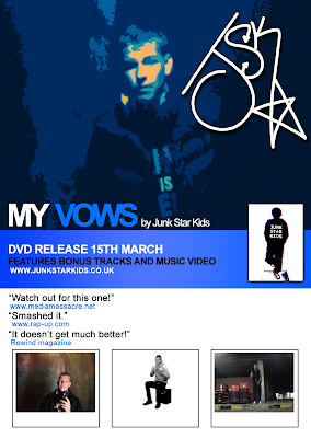
Here is my final design for the magazine advert. Personally I think that it has become a very effective piece of advertisement, that, if used in the real world industry, would help to majorly populate fans for this artist and spread the word of his new arrival to the scene.
(Click image to view full resolution)
From the previous versions, I decided to make a few minor changes, which would improve the appearance of the advert. I decided to include snapshots of the music video, to fill the blank space at the bottom of the page, but also to show what would be included in the DVD, and some more images of the new artist which is being advertised here, showing the three different scenes that were dominant in the video. I made two text ammendments; the "It doesn't much get better!" testimonial was a typo so I fixed that, and changed the colours of the line "Features bonus tracks..", to be all one colour, to avoid any confusion when looking at it. The preview image of the DVD, placed on the centre-right of the page was resized to a portrait-view to allow a more accurate preview rather than it being in the shape of a CD cover.
The idea of the main image was pretty simple, but it's outcome was better than I had intended. I decided to use an image from some of the original footage gained from the filming stage that I still had backed up, and then played around with some levels and curves effects to liven up the image and show a better contrast with the lighting, then adding a filter to give it a cartoon-like visual. The 'JSK' logo was a scan from an image the artist drew for me. Due to it being his signature he created for himself, I decided to use it as a logo for the artist.
(Click image to view full resolution)
The idea of the main image was pretty simple, but it's outcome was better than I had intended. I decided to use an image from some of the original footage gained from the filming stage that I still had backed up, and then played around with some levels and curves effects to liven up the image and show a better contrast with the lighting, then adding a filter to give it a cartoon-like visual. The 'JSK' logo was a scan from an image the artist drew for me. Due to it being his signature he created for himself, I decided to use it as a logo for the artist.

(Click image to view full resolution)
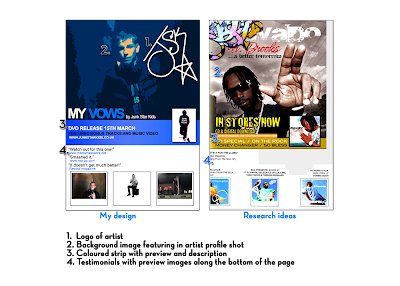
As you can see from the image above, I have displayed a design from the magazine adverts I have looked at to represent the design I created, and how I thought of the ideas to use them. Several different adverts were placed together so that I had the ideas, and the final product looks somewhat similar, but alot better than the image I created to work as the template.
From following ideas researched from magazines, I have followed typical styles included within my genre for adverts in magazines. The image of the artist is the focal point within the magazines, with his/her logo or name being the second largest image, to show the importance of the artist. Testimonials will be used sometimes, to then convince the reader to buy the product because it will say how good it is, giving other people's opinions, being biassed towards it, but making you feel confident in wanting to buy it from what they say. If the artist has other music albums available, or if the record label they are signed to has other artists, then images of their CD's will be shown. As my advertisement is for a DVD, I decided to show previews of the music video, to work in the same way, by making the reader have a general idea of the genre and content from the images presented.
Sunday 7 February 2010
Second version of magazine advert
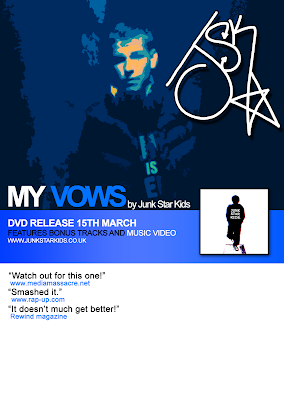
After the first attempt not going as planned, I decided to look for some inspiration, so I looked back at the music video and the original footage that was taken from it. I felt motivated again and I think that I've managed to find the right design for the advert now. I decided to use an image from the original uncut footage itself, as it links with the music video, and it shows a good top-half profile shot of the artist when we were recording footage, wearing Junk Star Kids clothing, therefore also advertising the clothing merchandise. Here's an image of the design so far;
(Click image to view full resolution)

(Click image to view full resolution)
I think this looks really good, as I have used a small amount of colours, white, blue and black, with the additional bit of red for the small square preview of the DVD. For the main image I used a filter, to give a cartoony look to it. I also changed the appearance using levels and curves to give it a brighter look which focuses on the artist, and also change the colours.
I had to play around with the settings to get the idea I was looking for, because I did want it to be visible to what it was, rather than it being abstract and not being able to make out what it was. Now I just need to finish the design, and then it is complete.
I had to play around with the settings to get the idea I was looking for, because I did want it to be visible to what it was, rather than it being abstract and not being able to make out what it was. Now I just need to finish the design, and then it is complete.
Thursday 4 February 2010
First draft of magazine advert
(Click image to view full resolution)
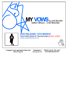
It looks nice because of the simplicity, but I feel that if I continued with this style to complete my magazine advert, that it would not be effective enough for a promotional advert, because of how plain it looks from a first glance. For my next attempt I will try to replicate some of the ideas from Flavour magazine, as there is more going on within the adverts in comparison to that of those I copied from in Big Smoke for this first attempt.
Subscribe to:
Posts (Atom)


